


























<style>
/* ================== OVERLAY WRAPPER ================== */
#delivery-overlay {
position: fixed;
right: 24px;
bottom: 24px;
width: 100%;
max-width: 36rem;
z-index: 9999;
opacity: 0;
pointer-events: none;
transition: opacity 0.3s ease;
font-family: inherit;
}
#delivery-overlay {
z-index: 10;
}
/* ================== CARD ================== */
#delivery-overlay .card {
position: relative;
display: flex;
gap: 16px;
padding: 16px 40px 16px 16px;
border-radius: 16px;
background: rgba(255,255,255,0.9);
backdrop-filter: blur(12px);
-webkit-backdrop-filter: blur(12px);
border: 1px solid #e5e7eb;
box-shadow: 0 20px 40px rgba(0,0,0,.15);
overflow: hidden;
}
/* decorative blur */
#delivery-overlay .blur-bg {
position: absolute;
top: -40px;
right: -40px;
width: 96px;
height: 96px;
background: rgba(59,130,246,0.12);
border-radius: 50%;
filter: blur(32px);
pointer-events: none;
}
/* ================== ICON ================== */
#delivery-overlay .icon-wrap {
flex-shrink: 0;
background: #dbeafe;
color: #2563eb;
padding: 10px;
border-radius: 999px;
}
/* ================== TEXT ================== */
#delivery-overlay .content {
display: flex;
flex-direction: column;
gap: 6px;
}
#delivery-overlay h3 {
margin: 0;
font-size: 1.4rem;
font-weight: 700;
color: #111827;
display: flex;
align-items: center;
gap: 8px;
}
#delivery-overlay p {
margin: 0;
font-size: 1.4rem;
color: #4b5563;
line-height: 1.4;
}
#delivery-overlay .bold {
font-weight: 700;
color: #111827;
}
/* badge */
#delivery-overlay .badge {
font-size: 10px;
font-weight: 700;
background: #2563eb;
color: #fff;
padding: 2px 6px 0;
border-radius: 999px;
text-transform: uppercase;
letter-spacing: .08em;
}
/* timer row */
#delivery-overlay .timer {
display: flex;
align-items: center;
gap: 6px;
margin-top: 4px;
font-size: 1rem;
color: #6b7280;
}
/* ================== CLOSE BUTTON ================== */
#delivery-overlay .close-btn {
position: absolute;
top: 8px;
right: 8px;
width: 28px;
height: 28px;
border-radius: 999px;
border: none;
background: transparent;
cursor: pointer;
color: #9ca3af;
display: flex;
align-items: center;
justify-content: center;
}
#delivery-overlay .close-btn:hover {
background: #f3f4f6;
color: #4b5563;
}
/* ================== ANIMATIONS ================== */
@keyframes slideIn {
from { transform: translateX(100%); opacity: 0; }
to { transform: translateX(0); opacity: 1; }
}
@keyframes fadeOut {
from { opacity: 1; }
to { opacity: 0; }
}
#delivery-overlay.show {
opacity: 1;
pointer-events: auto;
}
#delivery-overlay.slide-in {
animation: slideIn .5s cubic-bezier(.16,1,.3,1) forwards;
}
#delivery-overlay.fade-out {
animation: fadeOut .3s ease forwards;
}
/* ================== MOBILE ================== */
@media (max-width: 480px) {
#delivery-overlay {
right: 12px;
left: 12px;
max-width: none;
}
}
</style>
<!-- ================== HTML ================== -->
<div id="delivery-overlay">
<div class="card">
<div class="blur-bg"></div>
<div class="icon-wrap">
<svg xmlns="http://www.w3.org/2000/svg" width="20" height="20" viewBox="0 0 24 24" fill="none"
stroke="currentColor" stroke-width="2" stroke-linecap="round" stroke-linejoin="round">
<path d="M14 18V6a2 2 0 0 0-2-2H4a2 2 0 0 0-2 2v11a1 1 0 0 0 1 1h2"/>
<path d="M15 18H9"/>
<path d="M19 18h2a1 1 0 0 0 1-1v-5l-4-4h-3v10a1 1 0 0 0 1 1Z"/>
<circle cx="7" cy="18" r="2"/>
<circle cx="17" cy="18" r="2"/>
</svg>
</div>
<div class="content">
<h3>
Fast Delivery
<span class="badge">Next Day</span>
</h3>
<p>
All orders placed before <span class="bold">5:00 PM</span> are delivered Next Day.
</p>
<div class="timer" style="display: none;">
<svg xmlns="http://www.w3.org/2000/svg" width="12" height="12" viewBox="0 0 24 24" fill="none"
stroke="currentColor" stroke-width="2" stroke-linecap="round" stroke-linejoin="round">
<circle cx="12" cy="12" r="10"/>
<polyline points="12 6 12 12 16 14"/>
</svg>
<span id="delivery-timer">Time remaining: --h --m --s</span>
</div>
</div>
</div>
</a>
<button class="close-btn" id="close-overlay" aria-label="Close">
<svg xmlns="http://www.w3.org/2000/svg" width="14" height="14" viewBox="0 0 24 24" fill="none"
stroke="currentColor" stroke-width="2" stroke-linecap="round" stroke-linejoin="round">
<path d="M18 6 6 18"/>
<path d="m6 6 12 12"/>
</svg>
</button>
</div>
<script>
document.addEventListener("DOMContentLoaded", function () {
const overlay = document.getElementById('delivery-overlay');
const closeBtn = document.getElementById('close-overlay');
const timerEl = document.getElementById('delivery-timer');
if (!overlay || !closeBtn || !timerEl) return;
// -------- show overlay --------
setTimeout(() => {
overlay.classList.add('show', 'slide-in');
}, 1500);
closeBtn.addEventListener('click', () => {
overlay.classList.remove('slide-in');
overlay.classList.add('fade-out');
setTimeout(() => overlay.style.display = 'none', 300);
});
// -------- UK TIME COUNTDOWN --------
function getUKNow() {
const parts = new Intl.DateTimeFormat('en-GB', {
timeZone: 'Europe/London',
year: 'numeric', month: 'numeric', day: 'numeric',
hour: 'numeric', minute: 'numeric', second: 'numeric',
hour12: false
}).formatToParts(new Date());
const g = t => parts.find(p => p.type === t).value;
return new Date(g('year'), g('month') - 1, g('day'), g('hour'), g('minute'), g('second'));
}
function updateTimer() {
const now = getUKNow();
const cutoff = new Date(now);
cutoff.setHours(17, 30, 0, 0); // 5:30 PM UK
if (now >= cutoff) cutoff.setDate(cutoff.getDate() + 1);
const diff = cutoff - now;
if (diff <= 0) return;
const s = Math.floor(diff / 1000);
const h = Math.floor(s / 3600);
const m = Math.floor((s % 3600) / 60);
const sec = s % 60;
timerEl.textContent =
`Time remaining: ${String(h).padStart(2,'0')}h ` +
`${String(m).padStart(2,'0')}m ` +
`${String(sec).padStart(2,'0')}s`;
}
updateTimer();
setInterval(updateTimer, 1000);
});
</script>








<div class="jumbotron no-padding">
<!-- <div class="slider-bg"><img src="https://staging.vita-point.co.uk/media/wysiwyg/homepage/mp-slider-bg.svg" alt="Slider Background" /></div>-->
<div class="container navpro-expanded"></div>
</div>
<div class="jumbotron benefits">
<div class="container navpro-expanded">
<div class="benefits-top">
<div class="benefits-top-child">
<div class="icon"><i class="fa fa-money" style="font-size: xx-large"></i></div>
<div class="content"><p style="font-weight: bold; margin-bottom: 0">LOWEST PRICE POSSIBLE</p><p style="font-weight: 100; font-size: small; margin-bottom: 0">Special discounted prices on bulk orders.</p></div>
</div>
<div class="benefits-top-child">
<div class="icon"><i class="fa fa-list-ol" style="font-size: xx-large"></i></div>
<div class="content"><p style="font-weight: bold; margin-bottom: 0">WIDE RANGE</p><p style="font-weight: 100; font-size: small; margin-bottom: 0">Extensive array of products for every need.</p></div>
</div>
<div class="benefits-top-child">
<div class="icon"><i class="fa fa-clock-o" style="font-size: xx-large"></i></div>
<div class="content"><p style="font-weight: bold; margin-bottom: 0">QUICK CUSTOMER SUPPORT</p><p style="font-weight: 100; font-size: small; margin-bottom: 0">Guaranteed resolution within 24 hours.</p></div>
</div>
<div class="benefits-top-child">
<div class="icon"><i class="fa fa-truck" style="font-size: xx-large"></i></div>
<div class="content"><p style="font-weight: bold; margin-bottom: 0">FREE NEXT DAY DELIVERY*</p><p style="font-weight: 100; font-size: small; margin-bottom: 0">On orders over £29.99 upto 10kg</p></div>
</div>
</div>
</div>
</div>
<!-- CSS for Top Selling -->
<style>
.topqty > * > * > * > ol.product-items.widget-product-grid {
padding: 0 30px;
}
.top-stocks-div {
max-width: 1440px !important;
margin: auto !important;
}
@media (min-width: 768px) and (max-width: 1022px) {
.topqty > * > * > * > * > li.product-item {
flex: 0 0 calc(100% / 3) !important;
box-sizing: border-box !important;
margin: 0 0 10px 10px !important;
max-width: calc(100% / 3 - 10px - 0.1px) !important;
}
}
@media (max-width: 767px) {
.topqty > * > * > * > ol.product-items.widget-product-grid {
padding: 0px !important;
}
.topqty > * > * > * > * > li.product-item {
flex: 0 0 calc(100% / 2) !important;
box-sizing: border-box !important;
margin: 0 0 10px 10px !important;
max-width: calc(100% / 2 - 10px - 0.1px) !important;
}
img.product-image-photo {
height: auto !important;
}
.element.products-slider > * {
padding: 20px 15px !important;
}
}
.block.widget.block-products-list.grid::before {
content: "Top Selling";
display: block;
font-weight: bold;
font-size: 2.8rem;
margin: 0 0 22px !important;
}
.topqty > .block {
background: white;
border-radius: 7px;
}
img.product-image-photo {
/*height: 210px;*/
max-height: 170px;
}
.element.products-slider > * {
padding: 20px 30px;
}
@media (min-width: 1023px) {
.topqty > * > * > * > * > li.product-item {
flex: 0 0 calc(100% / 6) !important;
box-sizing: border-box !important;
margin: 0 0 10px 10px !important;
max-width: calc(100% / 6 - 10px - 0.1px) !important;
}
.topqty > * > * > * > * > * > * > * > * > * > .product-image-wrapper, .topqty > * > * > * > * > * > * > * > * > .product-image-wrapper {
padding-bottom: 100% !important;
}
.topqty > * > * > * > ol.product-items.widget-product-grid {
display: flex;
flex-wrap: wrap;
}
.product-item-photo > span {
width: 210px !important;
}
.product-image-wrapper {
overflow: visible !important;
}
</style>
-

-

-

-
 Kleenex Allergy Comfort Soft Tissue 56's - Pack of 1As low as £1.06 Regular Price £1.24
 -
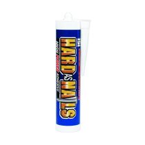
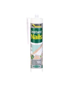 Everbuild Instant Nails White Gap Filling Adhesive Solvent Free Paintable 290mlAs low as £1.63 Regular Price £1.63
 -
-
-
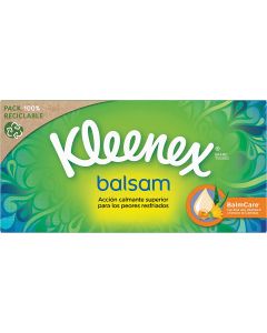 Kleenex Balsam Protective Balm Facial Tissues 64'sAs low as £1.38 Regular Price £1.48
 -
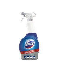
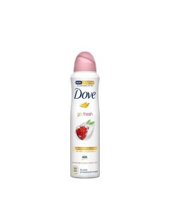 Dove Go Fresh Pomegranate Antiperspirant Deodorant Spray 250mlAs low as £2.76 Regular Price £3.62
 -
-
-
<style>
.page-header {
background-image: linear-gradient(to right, white 20%, #2d9cdb 20%, #2d9cdb 60%);
}
.cms-index-index .benefits-top .content {
max-width: 280px !important;
}
img.product-image-photo {
aspect-ratio: 210 / 210 !important;
}
.topqty>*>*>*>*>*>*>*>*>*>*>img.product-image-photo {
aspect-ratio: 240 / 300 !important;
max-height: 210px;
}
@media screen and (min-width: 1280px) {
.cms-index-index .jumbotron .navpro-expanded > div {
margin-left: 0 !important;
}
}
</style>
<!--
<div class="jumbotron no-padding">
<div class="slider-bg"><img src="https://staging.vita-point.co.uk/media/wysiwyg/homepage/mp-slider-bg.svg" alt="Slider Background" /></div>
<div class="container navpro-expanded"></div>
</div>
<div class="jumbotron benefits">
<div class="container navpro-expanded">
<div class="benefits-top">
<div class="benefits-top-child">
<div class="icon"><i class="fa fa-truck" style="font-size: xx-large"></i></div>
<div class="content"><p style="font-weight: bold; margin-bottom: 0">FREE SHIPPING OVER £29.99</p><p style="font-weight: 100; font-size: small; margin-bottom: 0">For order weights upto 14kg.</p></div>
</div>
<div class="benefits-top-child">
<div class="icon"><i class="fa fa-list-ol" style="font-size: xx-large"></i></div>
<div class="content"><p style="font-weight: bold; margin-bottom: 0">WIDE RANGE</p><p style="font-weight: 100; font-size: small; margin-bottom: 0">Extensive array of products for every need.</p></div>
</div>
<div class="benefits-top-child">
<div class="icon"><i class="fa fa-clock-o" style="font-size: xx-large"></i></div>
<div class="content"><p style="font-weight: bold; margin-bottom: 0">CUSTOMER SUPPORT 24x7</p><p style="font-weight: 100; font-size: small; margin-bottom: 0">Guaranteed resolution within 24 hours.</p></div>
</div>
<div class="benefits-top-child">
<div class="icon"><i class="fa fa-money" style="font-size: xx-large"></i></div>
<div class="content"><p style="font-weight: bold; margin-bottom: 0">LOWEST PRICE POSSIBLE</p><p style="font-weight: 100; font-size: small; margin-bottom: 0">Special discounted prices on bulk orders.</p></div>
</div>
</div>
</div>
</div>
-->
<div class="jumbotron jumbotron-pastel jumbotron-overlap" style="background: transparent">
<div class="container">
<!-- <div class="element products-slider">
</div>
-->
<!-- New Featured -->
<!-- <div class="element products-slider">
</div>
-->
<!-- End Featured -->
<!-- Start Top Selling -->
<!--
<div class="element products-slider">
</div>
-->
<!-- End Top Stocks -->
<!-- Start Category Household -->
<!-- <div class="element products-slider">
</div>-->
<div class="element products-slider">
</div>
<!-- End Category Household -->
<!-- Start Category Health & Beauty -->
<!-- <div class="element products-slider">
</div>-->
<div class="element products-slider">
</div>
<!-- End Category Health & Beauty -->
<!-- Start Category Haircare -->
<!-- <div class="element products-slider">
</div>-->
<div class="element products-slider">
</div>
<!-- End Category Haircare -->
<!-- Start Category Toiletries -->
<!-- <div class="element products-slider">
</div>-->
<div class="element products-slider">
</div>
<!-- End Category Toiletries -->
<!-- Start Category DIY -->
<!-- <div class="element products-slider">
</div>-->
<div class="element products-slider">
</div>
<!-- End Category DIY -->
<!-- <div class="element products-slider">
</div>-->
<!-- <div class="element products-slider">
</div>-->
<div class="element products-slider">
</div>
<!-- <div class="element products-slider">
</div>-->
<!--<div class="element products-slider">
</div>-->
<div class="block popular-categories">
<div class="block-title">
<strong role="heading" aria-level="2">Popular categories</strong>
<!-- <p class="subtitle">
<a class="action view" href="https://staging.vita-point.co.uk/departments/" title="View All">
<span>View All</span>
</a>
</p>-->
</div>
<div class="block-content" data-mage-init='{"Swissup_Swiper/js/swiper-wrapper": {"target": ".easycatalogimg", "loop": false, "slidesPerView": 5, "spaceBetween": 5, "breakpoints": {"1023": {"slidesPerView": 4}, "767": {"slidesPerView": 2}, "640": {"slidesPerView": 1}}}}'>
</div>
</div>
<!--<div class="block banners">
<div class="container a-center">
</div>
</div>-->
<div class="block apps a-center">
<div class="container">
<div class="apps-bg">
<img src="https://staging.vita-point.co.uk/media/wysiwyg/Website-banner.gif" alt="" />
</a>
</div>
<!--<div class="content">
<h2>Get the Mobile App</h2>
<div class="info">
<p>Buy and sell anytime, anywhere</p>
<p>and always make the best deals</p>
</div>
<a class="store-link" href="https://play.google.com/" title="Get on Google Play"><img src="https://staging.vita-point.co.uk/media/wysiwyg/homepage/apps/google.svg" alt="Get on Google Play" /></a><a class="store-link" href="https://www.apple.com/app-store/" title="Download on the App Store"><img src="https://staging.vita-point.co.uk/media/wysiwyg/homepage/apps/ios.svg" alt="Download on the App Store" /></a>
</div>-->
</div>
</div>
</div>
</div>
<!--
<div class="jumbotron hero">
<div class="container">
<div class="element icon-text-top">
<div class="content">
<div class="item">
<div class="icon mp-icon mp-icon-big mp-cards"></div>
<div class="info">
<h3 class="title">Pay with credit card or PayPal</h3>
<div class="text">
<p>With our advanced payment module you can select the payment menthod that fits! And always secure!</p>
<a href="https://staging.vita-point.co.uk/payments/" title="More about payments">More about payments</a>
</div>
</div>
</div>
<div class="item">
<div class="icon mp-icon mp-icon-big mp-shipping"></div>
<div class="info">
<h3 class="title">Free shipping starting at $50</h3>
<div class="text">
<p>Benefit from our free shipping worldwide policy to get your products wherever you need them.</p>
<a href="https://staging.vita-point.co.uk/shipping/" title="More about shipping">More about shipping</a>
</div>
</div>
</div>
<div class="item">
<div class="icon mp-icon mp-icon-big mp-secure"></div>
<div class="info">
<h3 class="title">Security, from start to finish</h3>
<div class="text">
<p>We take security very seriously. This is why we don’t store your data and encrypt all transactions.</p>
<a href="https://staging.vita-point.co.uk/security/" title="More about security">More about security</a>
</div>
</div>
</div>
</div>
</div>
</div>
</div>
-->
<div class="jumbotron hero">
<div class="container">
<div class="block row widget block-carousel">
<div class="block-title">
<strong>Browse brands</strong>
</div>
<div class="block-content">
<!---->

















 </div>
</div>
</div>
<div class="jumbotron">
<div class="container">
<div class="block categories-bottom">
<div class="block-content">
</div>
</div>
</div>
</div>
</div>
</div>
</div>
</div>
<div class="jumbotron">
<div class="container">
<div class="block categories-bottom">
<div class="block-content">
</div>
</div>
</div>
</div>
Top selling
-
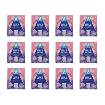 Astonish Toilet Bowl Fizz & Fresh Tabs Pink Peony Fresh 8 Tablets - Pack of 12Special Price £21.34 Regular Price £28.34
 -
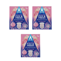 Astonish Toilet Bowl Fizz & Fresh Tabs Pink Peony Fresh 8 Tablets - Pack of 3Special Price £5.50 Regular Price £6.41
 -
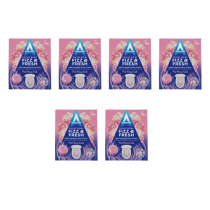 Astonish Toilet Bowl Fizz & Fresh Tabs Pink Peony Fresh 8 Tablets - Pack of 6Special Price £10.67 Regular Price £13.63
 -
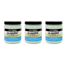 Aunt Jackies In Control Moisturizing & Softening Conditioner 426g - Pack of 3Special Price £21.01 Regular Price £25.27
 -
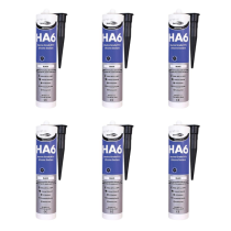 Bond It Premiere HA6 Black Marine Grade RTV Silicone Sealant 310ml - Pack of 6Special Price £17.88 Regular Price £21.32
 -
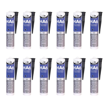 Bond It Premiere HA6 Black Marine Grade RTV Silicone Sealant 310ml - Pack of 12Special Price £35.76 Regular Price £44.32
Featured Products
-
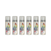 Colour Culture Glitter Hair & Body Spray 125ml - Pack of 6Special Price £11.33 Regular Price £14.22
 -

-
-
-
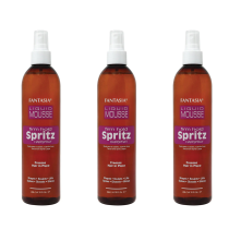 Fantasia Hair Spray Liquid Mousse Firm Hold Spritz 295.7ml - Pack of 3Special Price £15.54 Regular Price £18.90
 -
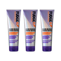 Fudge Clean Blonde Damage Rewind Violet-Toning Conditioner 250ml - Pack of 3Special Price £19.80 Regular Price £25.32
 -
-
 Dove Rich Nourishment Body Cream Intensive Moisturizing Care 75ml x 12Special Price £12.54 Regular Price £17.50
 -
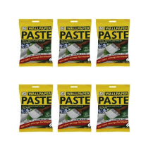 151 Wallpaper Paste 6 Pint Pack 5 Rolls For All Types Paper - Pack of 6Special Price £5.40 Regular Price £7.03
 -
-
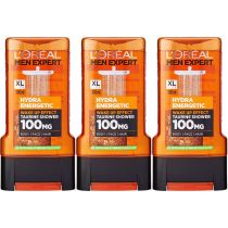 Loreal Men Expert Shower Gel Hydra Energetic 300ml - Pack of 3Special Price £9.36 Regular Price £11.65
 -
Top selling
-
Astonish Toilet Bowl Fizz & Fresh Tabs Pink Peony Fresh 8 Tablets - Pack of 12Special Price £21.34 Regular Price £28.34
-
Astonish Toilet Bowl Fizz & Fresh Tabs Pink Peony Fresh 8 Tablets - Pack of 3Special Price £5.50 Regular Price £6.41
-
Astonish Toilet Bowl Fizz & Fresh Tabs Pink Peony Fresh 8 Tablets - Pack of 6Special Price £10.67 Regular Price £13.63
-
Aunt Jackies In Control Moisturizing & Softening Conditioner 426g - Pack of 3Special Price £21.01 Regular Price £25.27
-
Bond It Premiere HA6 Black Marine Grade RTV Silicone Sealant 310ml - Pack of 6Special Price £17.88 Regular Price £21.32
-
Bond It Premiere HA6 Black Marine Grade RTV Silicone Sealant 310ml - Pack of 12Special Price £35.76 Regular Price £44.32
Household
Household
Health & Beauty
Health & Beauty
Haircare
-
-
-
-
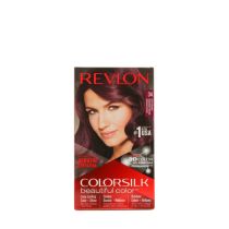
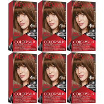 Revlon Colorsilk Beautiful Color Medium Golden Brown 43 - Pack of 6Special Price £17.32 Regular Price £21.74
 -
Haircare
Toiletries
Toiletries
DIY
DIY
New Arrivals
-
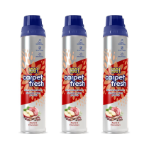 1001 Carpet Fresh Apple & Cinnamon Carpet Foam Freshener 300ml - Pack of 3Special Price £3.08 Regular Price £6.52
 -
 1001 Carpet Fresh Apple & Cinnamon Carpet Foam Freshener 300ml - Pack of 6Special Price £5.98 Regular Price £13.02
 -
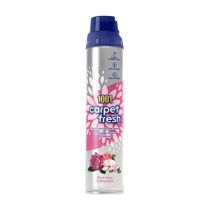
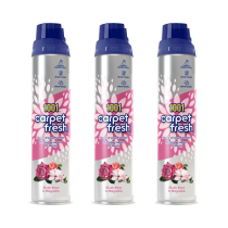 1001 Carpet Fresh Blush Rose & Magnolia Carpet Foam Freshener 300ml - Pack of 3Special Price £4.75 Regular Price £7.81
 -
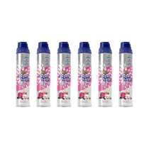 1001 Carpet Fresh Blush Rose & Magnolia Carpet Foam Freshener 300ml - Pack of 6Special Price £9.22 Regular Price £15.62
New Arrivals
Bestsellers
New Arrivals
-
Astonish Toilet Bowl Fizz & Fresh Tabs Pink Peony Fresh 8 Tablets - Pack of 12Special Price £21.34 Regular Price £28.34
-
Astonish Toilet Bowl Fizz & Fresh Tabs Pink Peony Fresh 8 Tablets - Pack of 3Special Price £5.50 Regular Price £6.41
-
Astonish Toilet Bowl Fizz & Fresh Tabs Pink Peony Fresh 8 Tablets - Pack of 6Special Price £10.67 Regular Price £13.63
-
Aunt Jackies In Control Moisturizing & Softening Conditioner 426g - Pack of 3Special Price £21.01 Regular Price £25.27
-
Bond It Premiere HA6 Black Marine Grade RTV Silicone Sealant 310ml - Pack of 6Special Price £17.88 Regular Price £21.32
-
Bond It Premiere HA6 Black Marine Grade RTV Silicone Sealant 310ml - Pack of 12Special Price £35.76 Regular Price £44.32
New Arrivals
-
Astonish Toilet Bowl Fizz & Fresh Tabs Pink Peony Fresh 8 Tablets - Pack of 12Special Price £21.34 Regular Price £28.34
-
Astonish Toilet Bowl Fizz & Fresh Tabs Pink Peony Fresh 8 Tablets - Pack of 3Special Price £5.50 Regular Price £6.41
-
Astonish Toilet Bowl Fizz & Fresh Tabs Pink Peony Fresh 8 Tablets - Pack of 6Special Price £10.67 Regular Price £13.63
-
Aunt Jackies In Control Moisturizing & Softening Conditioner 426g - Pack of 3Special Price £21.01 Regular Price £25.27
-
Bond It Premiere HA6 Black Marine Grade RTV Silicone Sealant 310ml - Pack of 6Special Price £17.88 Regular Price £21.32
-
Bond It Premiere HA6 Black Marine Grade RTV Silicone Sealant 310ml - Pack of 12Special Price £35.76 Regular Price £44.32
<!-- Custom CSS-->
<style>
.parent-category {
display: none !important;
}
@media (min-width: 768px) {
.homepage-slider-mobile-view {
display: none !important;
}
}
@media (max-width: 767px) {
.homepage-slider-desktop-view {
display: none !important;
}
}
/*
.action.tocart.primary > span {
visibility: hidden;
position: relative;
}
*/
/*
.action.tocart.primary > span::before {
content: 'Buy' !important;
visibility: visible;
position: absolute;
width: -webkit-fill-available;
}
*/
.product-item-info > a > span > span> img {
max-height: 100% !important;
max-width: 100% !important;
}
/* hide my wishlist*/
.product-item-details {
padding-left: inherit !important;
padding-right: inherit !important;
}
@media (min-width: 769px), print {
.page-header div.wishlist {
display: none !important;
}
}
</style>